
Project type
Design System & Digital Campaign
Design System &
Digital Campaign
Year
2023
My role
Senior Visual Designer
Client
Microsoft
Project overview
To cement Azure’s leadership in the cloud-native space, we developed an integrated creative framework focused on three core objectives: amplifying the narrative of 'Intelligent Apps,' deepening community resonance through high-value engagement, and accelerating the developer journey from curiosity to expertise via comprehensive Azure skilling.
The brief
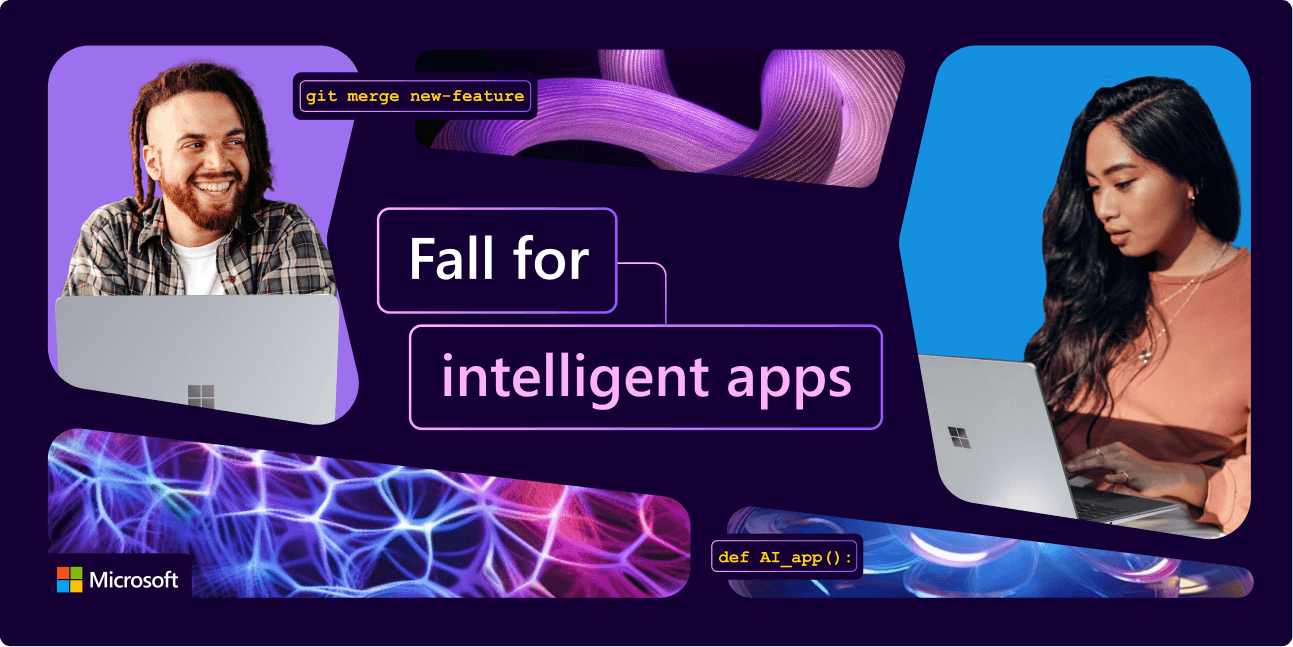
Create a fresh and exciting design system and core asset library for the Intelligent Apps Solution Play marketing efforts; visually representing Microsoft’s cutting-edge technology.
Create a fresh and exciting design system and core asset library for the Intelligent Apps Solution Play marketing efforts; visually representing Microsoft’s cutting-edge technology.
The problem
The AI hype cycle has created a "cool kids" club of ML Engineers, leaving standard app developers feeling like the tools of the future aren't built for them.
The Friction: * Accessibility: Developers feel they lack the specialized "math-heavy" background for AI and a misconception that building intelligent apps requires starting from scratch.
The AI hype cycle has created a "cool kids" club of ML Engineers, leaving standard app developers feeling like the tools of the future aren't built for them.
The Friction: * Accessibility: Developers feel they lack the specialized "math-heavy" background for AI and a misconception that building intelligent apps requires starting from scratch.
The challenge
We needed to move the needle from "That's not for me" to "I'm already halfway there." We are democratizing "Intelligent App" development by proving that with Azure, their existing skills are their greatest asset.
We needed to move the needle from "That's not for me" to "I'm already halfway there." We are democratizing "Intelligent App" development by proving that with Azure, their existing skills are their greatest asset.
The research
Brand audit
To ground the work, we conducted a brand audit across Microsoft Developer's digital presence — surveying social, web, event, and product touchpoints. The audit surfaced three key observations: purple appears as a consistent thread throughout the ecosystem, gradients are a dominant but inconsistently applied visual device, and the use of 2D and 3D graphics varies considerably across surfaces. Together, these insights shaped the foundation for a more cohesive and scalable design system.
Campaign audit
Before redesigning, we audited the previous Cloud-Native New Year campaign to understand where the visual system was falling short. Three observations shaped our next move: the palette leaned heavily on deep purple, creating a tone that felt too serious for the community it was meant to celebrate. Iconography and 3D graphics were competing rather than complementing each other, weakening the visual hierarchy. And although the campaign itself was built around celebration and play, the creative didn't reflect that spirit. Together, these findings gave us a clear brief: bring the fun back to the surface.
Competitive Analysis
To understand the competitive landscape, we audited the developer-facing experiences of Google Cloud, AWS, and Oracle Cloud Infrastructure. Two insights emerged. First, the category is saying the same thing: all three brands lead with "faster" as their core value proposition, leaving the message undifferentiated. Second, the category looks the same: Google is clean but impersonal, AWS relies on iconography to carry meaning, and OCI feels corporate and flat. What unites them — and what none of them are using well — is whitespace. Where competitors treat it as empty space, we saw it as an opportunity: room to inject personality, warmth, and a distinctly human tone into Microsoft Developer's visual language.
Brand audit
To ground the work, we conducted a brand audit across Microsoft Developer's digital presence — surveying social, web, event, and product touchpoints. The audit surfaced three key observations: purple appears as a consistent thread throughout the ecosystem, gradients are a dominant but inconsistently applied visual device, and the use of 2D and 3D graphics varies considerably across surfaces. Together, these insights shaped the foundation for a more cohesive and scalable design system.
Campaign audit
Before redesigning, we audited the previous Cloud-Native New Year campaign to understand where the visual system was falling short. Three observations shaped our next move: the palette leaned heavily on deep purple, creating a tone that felt too serious for the community it was meant to celebrate. Iconography and 3D graphics were competing rather than complementing each other, weakening the visual hierarchy. And although the campaign itself was built around celebration and play, the creative didn't reflect that spirit. Together, these findings gave us a clear brief: bring the fun back to the surface.
Competitive Analysis
To understand the competitive landscape, we audited the developer-facing experiences of Google Cloud, AWS, and Oracle Cloud Infrastructure. Two insights emerged. First, the category is saying the same thing: all three brands lead with "faster" as their core value proposition, leaving the message undifferentiated. Second, the category looks the same: Google is clean but impersonal, AWS relies on iconography to carry meaning, and OCI feels corporate and flat. What unites them — and what none of them are using well — is whitespace. Where competitors treat it as empty space, we saw it as an opportunity: room to inject personality, warmth, and a distinctly human tone into Microsoft Developer's visual language.
Brand audit
To ground the work, we conducted a brand audit across Microsoft Developer's digital presence — surveying social, web, event, and product touchpoints. The audit surfaced three key observations: purple appears as a consistent thread throughout the ecosystem, gradients are a dominant but inconsistently applied visual device, and the use of 2D and 3D graphics varies considerably across surfaces. Together, these insights shaped the foundation for a more cohesive and scalable design system.
Campaign audit
Before redesigning, we audited the previous Cloud-Native New Year campaign to understand where the visual system was falling short. Three observations shaped our next move: the palette leaned heavily on deep purple, creating a tone that felt too serious for the community it was meant to celebrate. Iconography and 3D graphics were competing rather than complementing each other, weakening the visual hierarchy. And although the campaign itself was built around celebration and play, the creative didn't reflect that spirit. Together, these findings gave us a clear brief: bring the fun back to the surface.
Competitive Analysis
To understand the competitive landscape, we audited the developer-facing experiences of Google Cloud, AWS, and Oracle Cloud Infrastructure. Two insights emerged. First, the category is saying the same thing: all three brands lead with "faster" as their core value proposition, leaving the message undifferentiated. Second, the category looks the same: Google is clean but impersonal, AWS relies on iconography to carry meaning, and OCI feels corporate and flat. What unites them — and what none of them are using well — is whitespace. Where competitors treat it as empty space, we saw it as an opportunity: room to inject personality, warmth, and a distinctly human tone into Microsoft Developer's visual language.
Creating the
visual system
Creating the
visual system
We shaped three creative territories (the client chose territory 1), each offering a distinct lens through which the brand could speak. The first explored community and collective impact, the second celebrated the journey of learning and growth, and the third championed creation and innovation.
We shaped three creative territories (the client chose territory 1), each offering a distinct lens through which the brand could speak. The first explored community and collective impact, the second celebrated the journey of learning and growth, and the third championed creation and innovation.
Explorations
Territory 1
Build better— together
Territory 1
Build better— together
Territory 1
Build better— together

Territory 2
Find the power in the process
Territory 2
Find the power in the process
Territory 2
Find the power in the process

Territory 3
Create today. Inspire tomorrow
Territory 3
Create today. Inspire tomorrow
Territory 3
Create today. Inspire tomorrow
The process
Driven by three core developer motivations: community connection, user-centric impact, and building high-performance applications I developed a modular visual language where geometric shapes represent individual contributors seamlessly interlocking. This system illustrates how collective collaboration drives innovative, groundbreaking work across digital touchpoints.
Driven by three core developer motivations: community connection, user-centric impact, and building high-performance applications I developed a modular visual language where geometric shapes represent individual contributors seamlessly interlocking. This system illustrates how collective collaboration drives innovative, groundbreaking work across digital touchpoints.


The concept:
Build better—together
The concept:
Build better—together
Modern development is as much about the collective power of community as it is about the individual pursuit of technical mastery. Our campaign, "Build better—together," taps into the developer's innate curiosity and drive to simplify complexity through the next generation of intelligent apps. By embracing sophisticated architectural patterns and modern AI frameworks, developers aren’t just expanding their skill sets—they are evolving the way we solve problems. This is an invitation to the lifelong learners and challenge-seekers to lead the next era of innovation, transforming collaborative curiosity into world-class, intelligent design.
Modern development is as much about the collective power of community as it is about the individual pursuit of technical mastery. Our campaign, "Build better—together," taps into the developer's innate curiosity and drive to simplify complexity through the next generation of intelligent apps. By embracing sophisticated architectural patterns and modern AI frameworks, developers aren’t just expanding their skill sets—they are evolving the way we solve problems. This is an invitation to the lifelong learners and challenge-seekers to lead the next era of innovation, transforming collaborative curiosity into world-class, intelligent design.


Final outcome
The final work hit the mark for both the client and their audience — so much so that the engagement grew into three full campaigns, all anchored by the design system we built.
The final work hit the mark for both the client and their audience — so much so that the engagement grew into three full campaigns, all anchored by the design system we built.
Final outcome
The final work hit the mark for both the client and their audience — so much so that the engagement grew into three full campaigns, all anchored by the design system we built.
The
The
The
Creative Director
Creative Director
Katrina Rossetti
Katrina Rossetti
Senior Visual Designer
Juliana Vallejo
Concept Development
Design System
Logo Design
Storyboarding Design
Expanded Materials
Copywriter
Kelly Sprague


